Data collection
The first step of this project was documenting everything I discarded between 01/19 - 01/26/23. I took note of many descriptive qualities of each item of trash such as color, material, discard location, etc.
Initial ideas
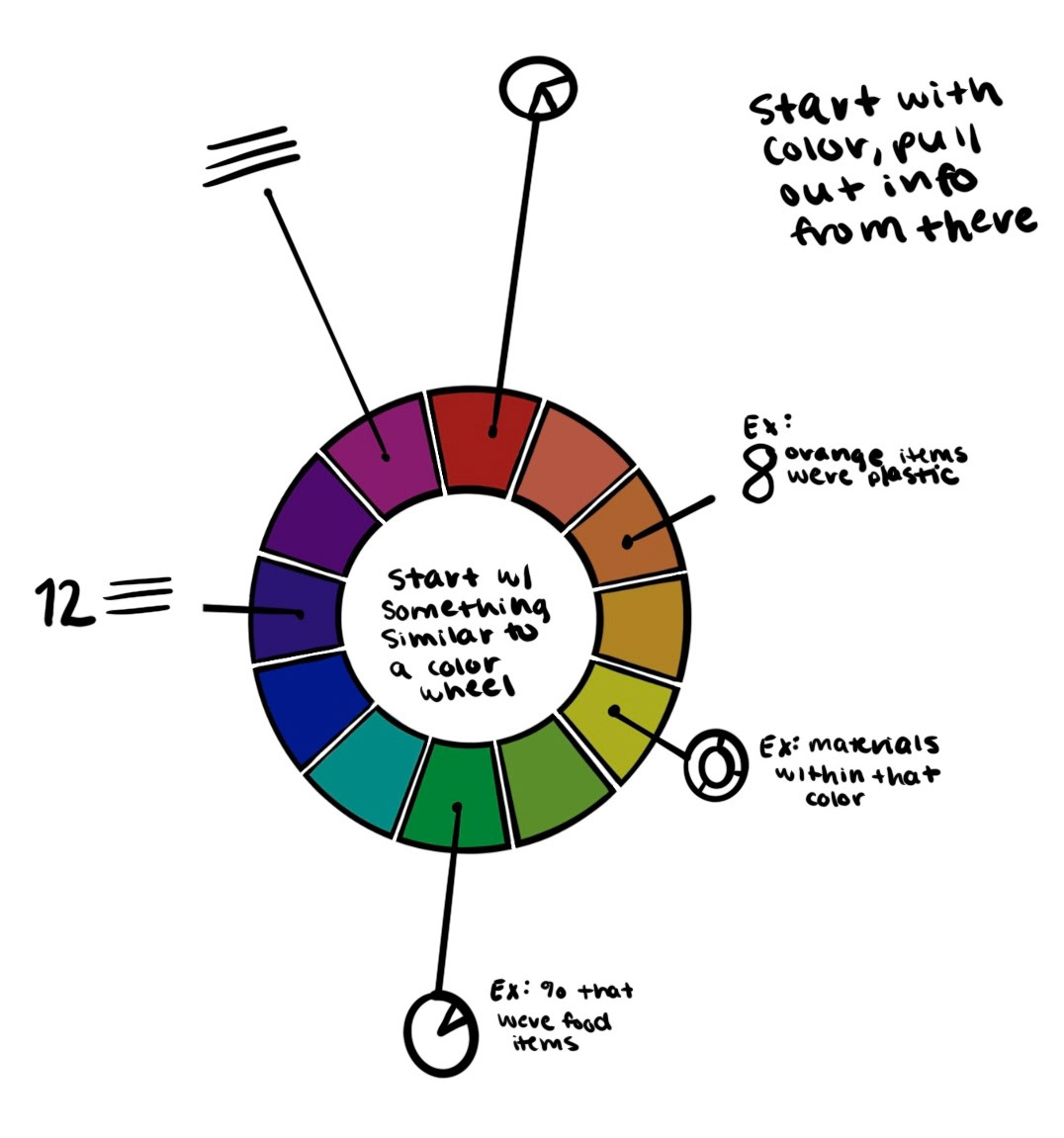
Below are images of my initial sketches and ideas. My overall goal was to create a new display of data, and I did not want to use a preexisting form of display such as a bar chart or a pie chart. Although effective, I wanted my final design to be more illustrative and reimagined.


Click to enlarge
concept sketches
After exploring multiple avenues pictured above, I narrowed down my ideas to create three concepts that I gained feedback on in class. Each concept shows a different hierarchy and framework of data.


Below is the feedback I received on my three concepts.
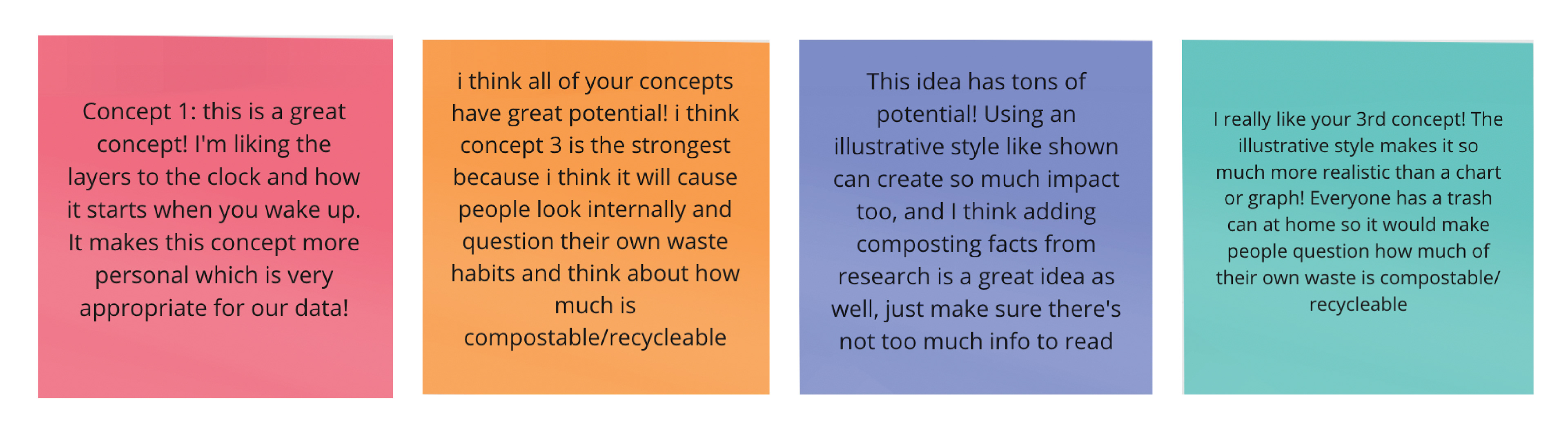
I decided to move forward with the clock design for multiple reasons. The main reason being I felt I came up with a unique form of data display and I was excited about where it could go.
improved drafts
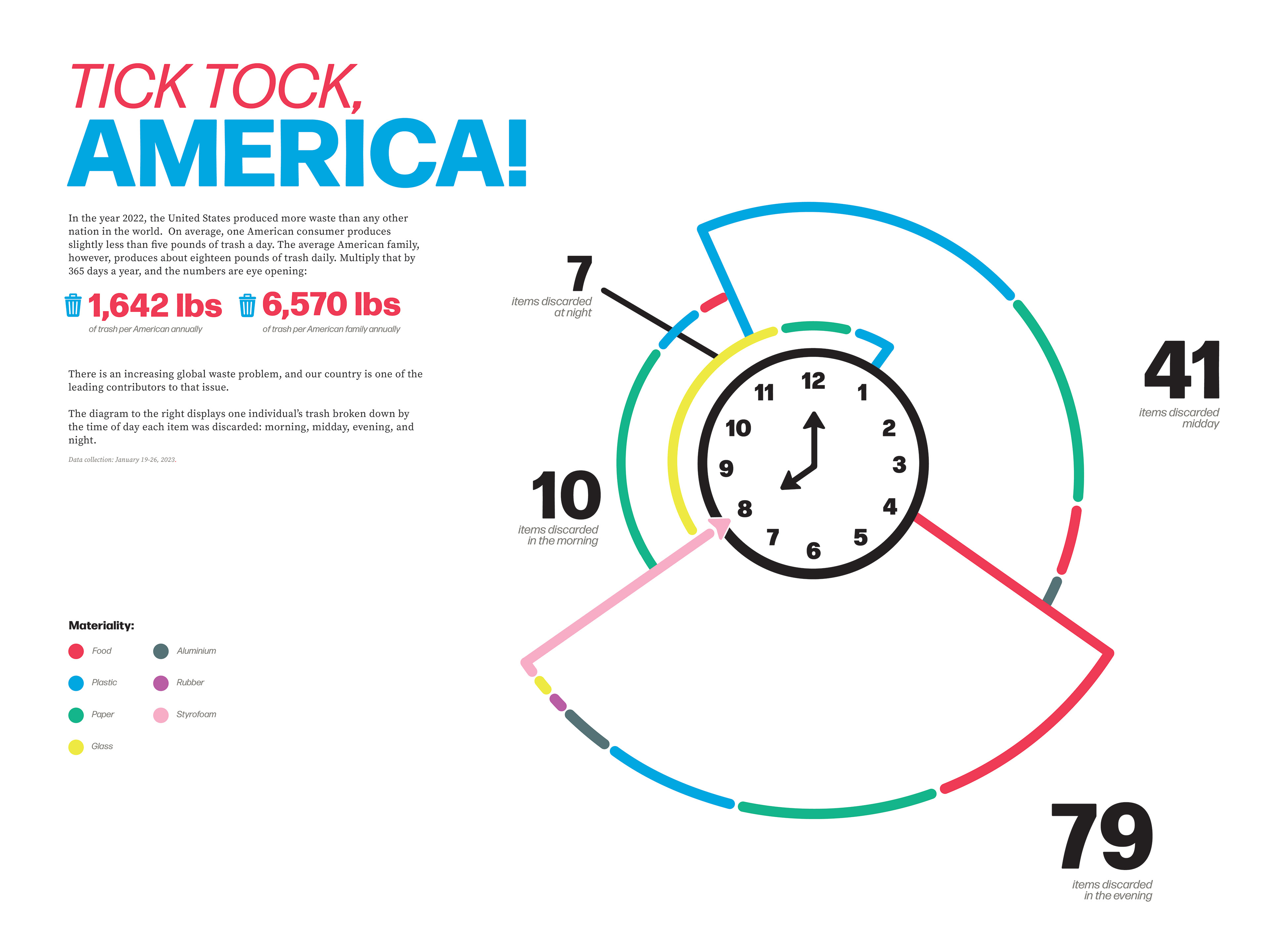
Once I landed on the clock concept, I drew a more refined concept sketch. Here I began to add layers of data. The idea here is that I am breaking down the clock by the time of day (morning, midday, evening, night). I then added another layer of information by pulling donut graphs out of each time block that break down material, number of items, and the color of trash.

I then began working digitally which is where I was able to begin cleaning up the design and refining the graph. After completing my first digital draft, I received more feedback which I documented below, along with new ideas of my own.

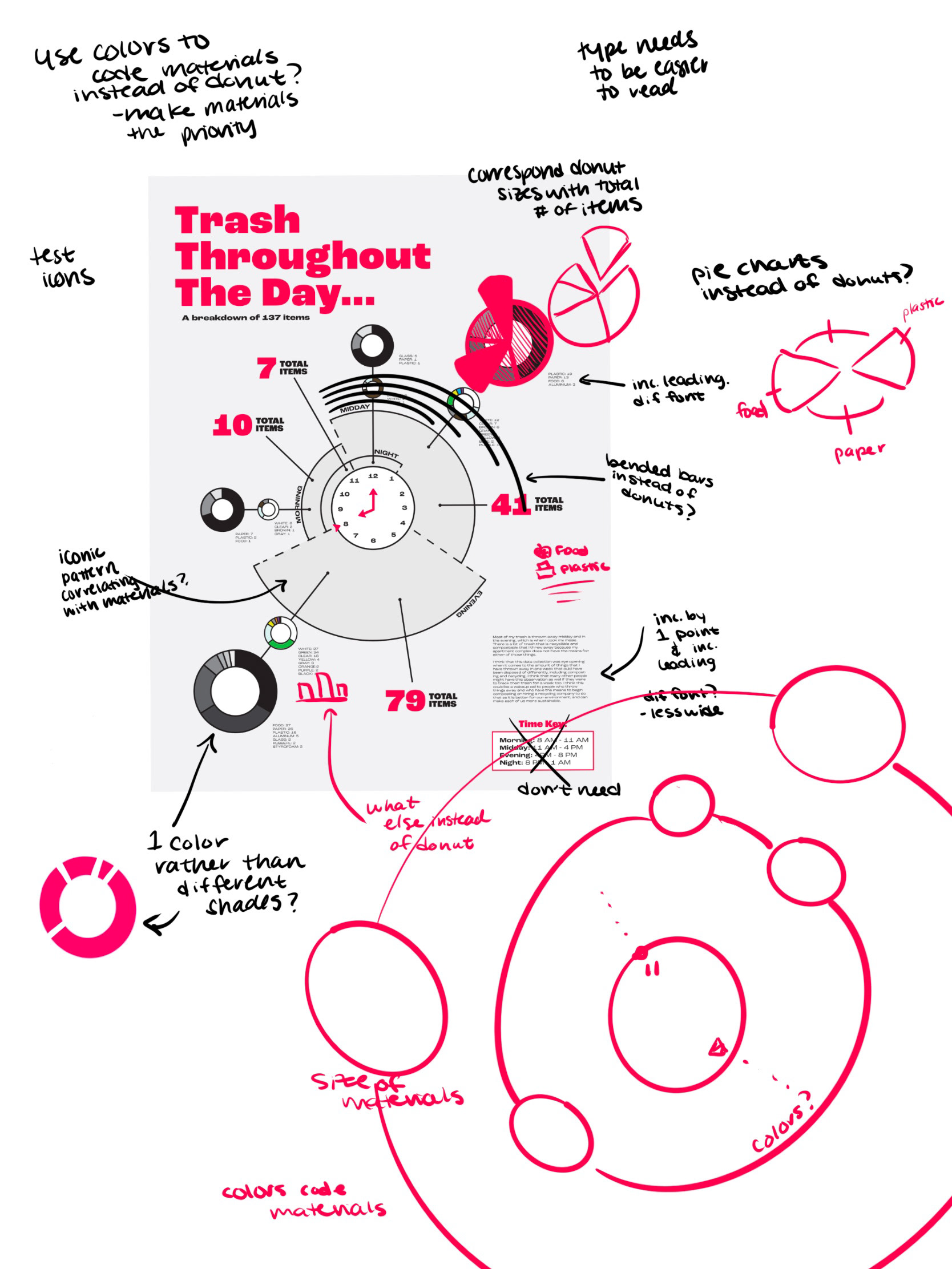
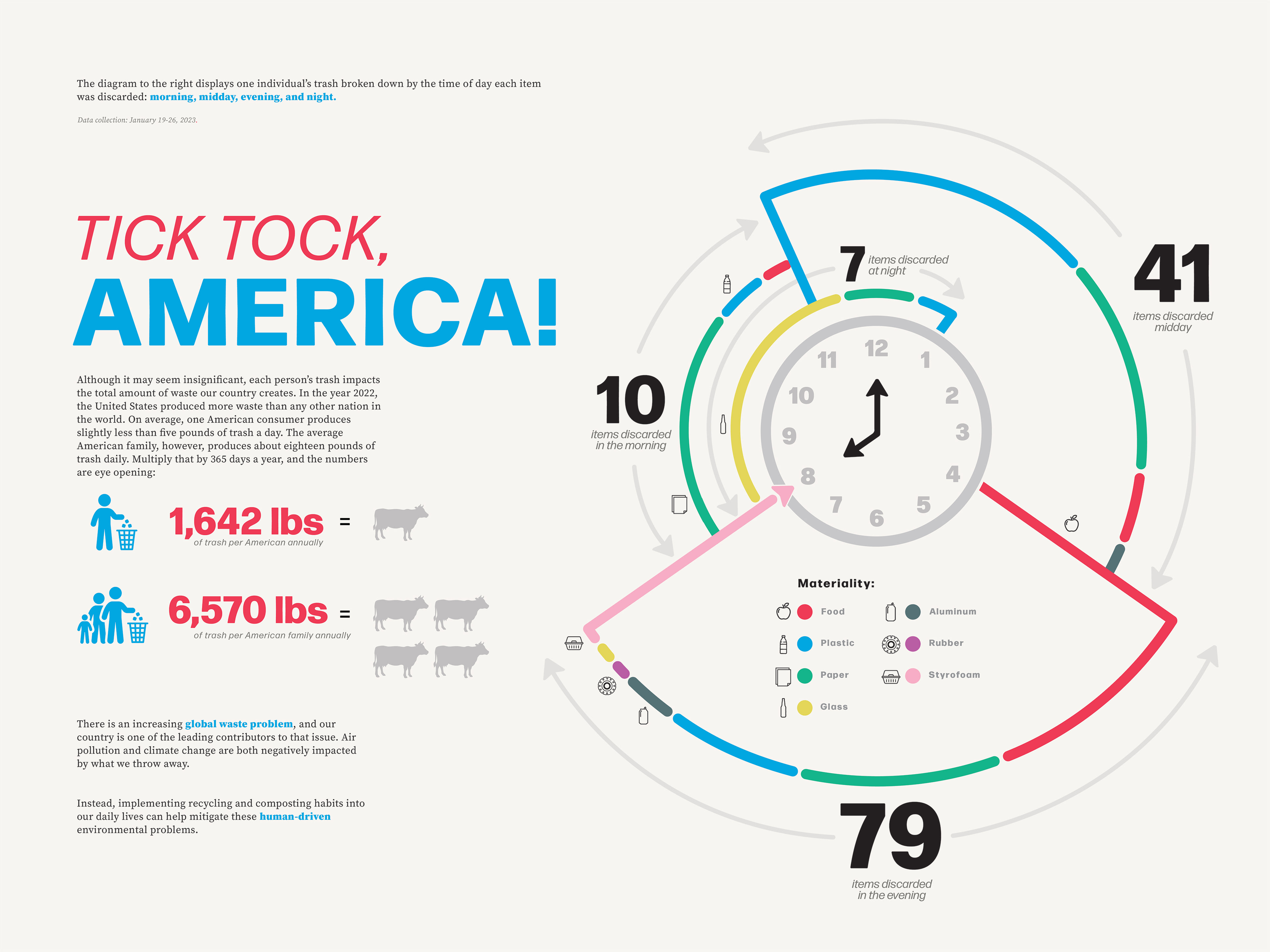
Using this feedback I was able to further refine my clock design, and added in a narrative to add another layer of data within this infographic poster. I decided to tell a story about the amount of waste that Americans produce daily, tying in the clock with the title. The goal of the entire design is a wake up call for Americans to be more mindful of their trash habits, resulting in a healthier living environment for our planet.
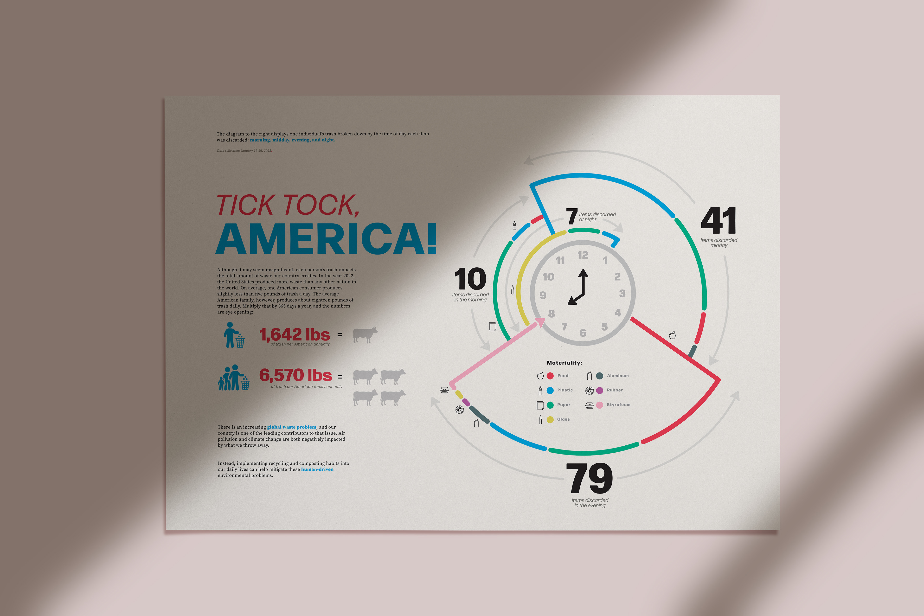
I received one more round of feedback before I completed this design. Here I was challenged to utilize icons more, as it would not only play off of my illustrative design, but it would also allow for the reader to better comprehend and easily read the data I laid out. During this final set of revisions I also revisited typography. I added text to supplement my narrative and then pulled out important words in order to create hierarchy.
Final Design
Within this design I was able to call out a nationwide issue by using my own data as an example. By using my trash documentation, I showed how I fit into the current waste issue and could spark self reflection for the viewer on their own trash habits.

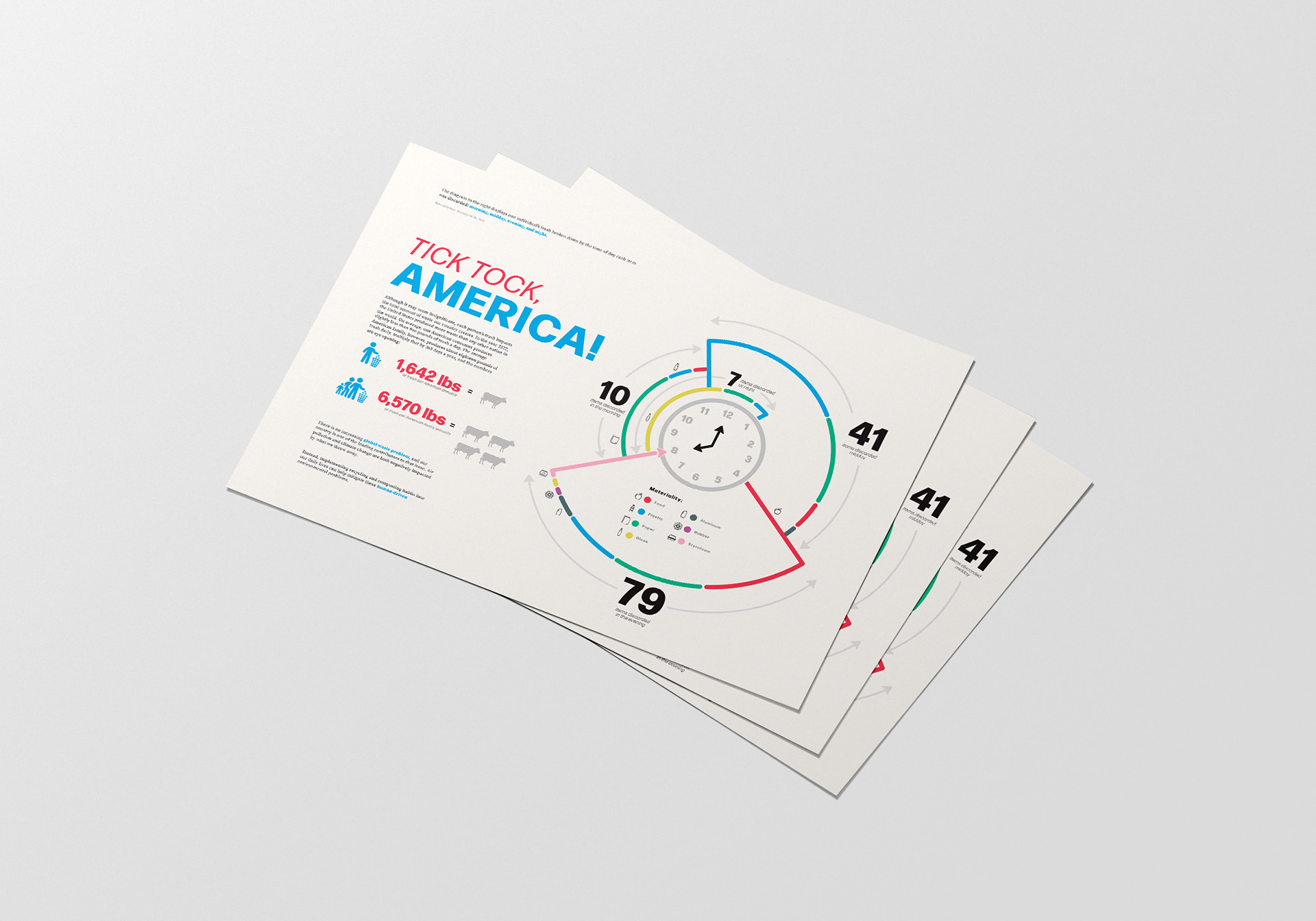
Design in use
Below are mockups of how I intended this infographic design to be presented. I imagined this design would be best served as posters and flyers in public areas. Because this narrative is such a universal issue, these two methods of print would reach a large demographic of people. I also imagined pieces and parts of this design could be used for social graphics.
What i learned
I learned a lot about waste problems within my country and how my habits are adding to that problem. Seeing a spreadsheet of everything that I threw away in one block of time, day, and week allowed me to see where I can make different decisions at the store to better reuse or recycle what I am purchasing. Secondly, I learned a lot about information graphics and data representation. I work a lot with infographics and different methods of displaying data at my internship, so using what I learned there for a completely new-to-me topic was a very educational experience. My professor's feedback expanded my thinking every time we spoke, and I am grateful for her guidance throughout this project.
Course
DESIGN 4153 with Yvette Shen
Tools Used
Adobe Illustrator