PETAL Wildlife (Protecting Environments, Territories, and Animal Life) is a nonprofit organization in California that strives to enrich the curriculum taught to children regarding wildlife and nature. The idea is that if we can get children to truly care about our environment and the animals that live among us, they might grow up to protect it themselves. I am passionate about animals and animal protection, which is why I chose this non-profit to rebrand.
The following page follows my entire process for this semester long project. To view the final brand identity and guidelines booklet, scroll to the very bottom of this page.
The original mark:
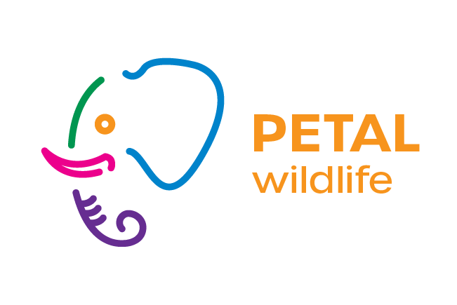
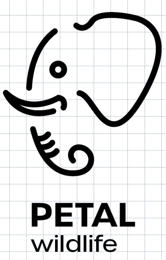
The redesigned mark:
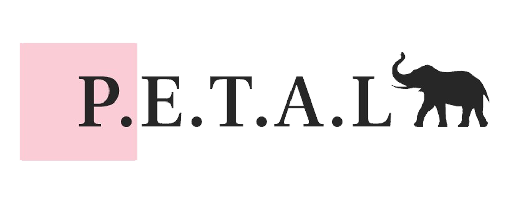
I began this redesign by first evaluating PETAL Wildlife's brand, and what I believe their current brand identity's problem is. I came to the conclusion that while their mission is most definitely about the protection of animals and wildlife, educating youth and the children they reach are equally important. I believed that their mark did not visually represent all of those key elements, which was an observation that guided my redesign process.
Research:
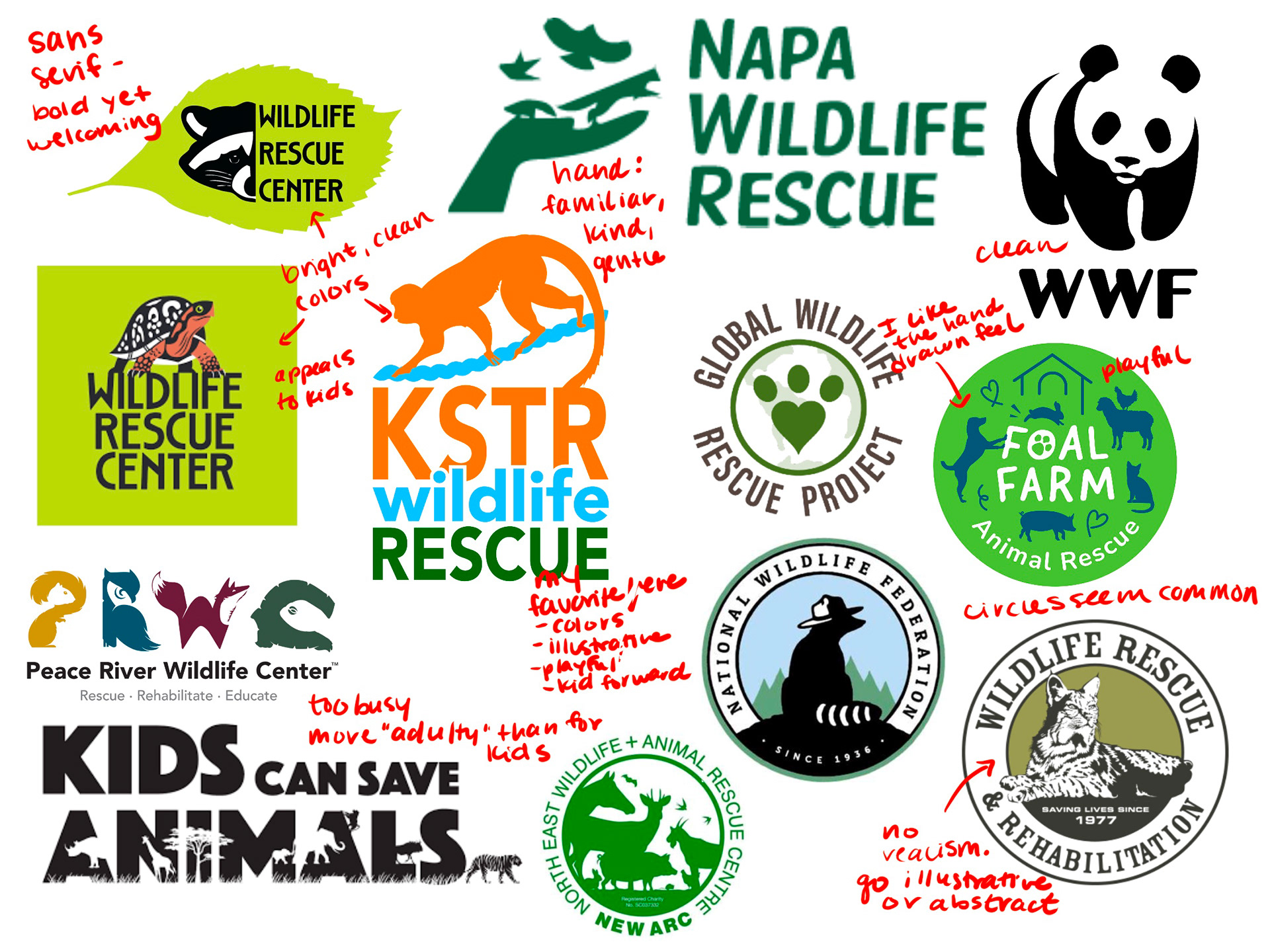
Looking into the branding for other wildlife organizations was an important step to this process. I was able to identify which aspects of other marks were aligning with my goals for PETAL Wildlife's redesign. This provided a great base of knowledge to guide my iterating process.
Sketching:
I then began sketching some initial thoughts which is jumbled below. I tried to separate the ideas of education and wildlife in order to draw out as many ideas as I could. I also separated my sketches into three categories: iconic, indexical, and symbolic.


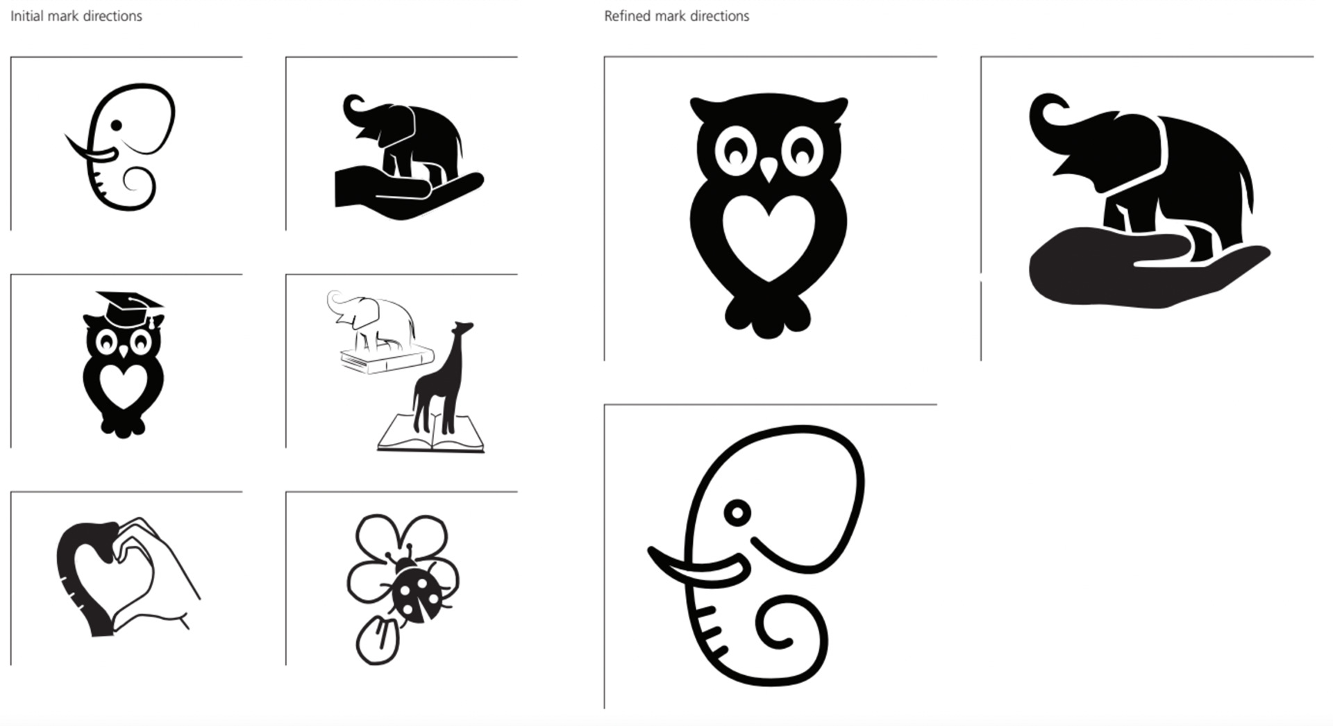
Initial Mark Directions:
I pulled out some potential ideas from my sketches above to begin refining some possible directions for PETAL Wildlife's new mark.

I then began working digitally which is where I further refined the ideas above.
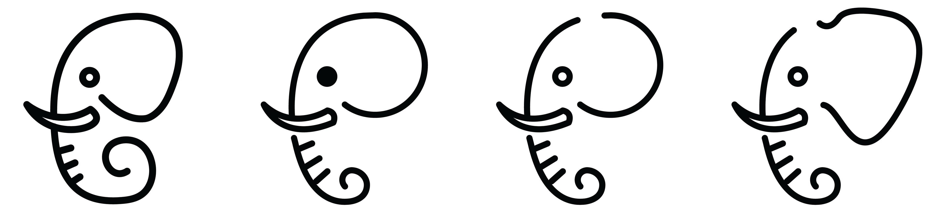
After refining the ideas above, I decided to move forward with the elephant face idea. I struggled with deciding between the hand holding an elephant and the elephant face, but I eventually landed on the elephant face because I felt the open shape along with the "hand drawn" organic feel represented what I was going for when it came to friendliness and a gentleness for children.
Class Critique:
My professor had us each print out out current progress and invited professional designers to our class critique. This group of designers happened to all work on a zoo project together, so they had a lot of helpful input when it came to the shape of my elephant's. I used my iPad to take notes and sketch new ideas during this class period. Those critiques/new ideas are below.

- define ear more. a more "triangular" shape would be more accurate
- let trunk drop down
- instead of a line drawing, make it a closed shape and allow it to be a container for an image
- needs more symmetry
- looks more like a whale or a slug than an elephant
- solid circle for eye
- modern serif could pair well. feminine and rounded
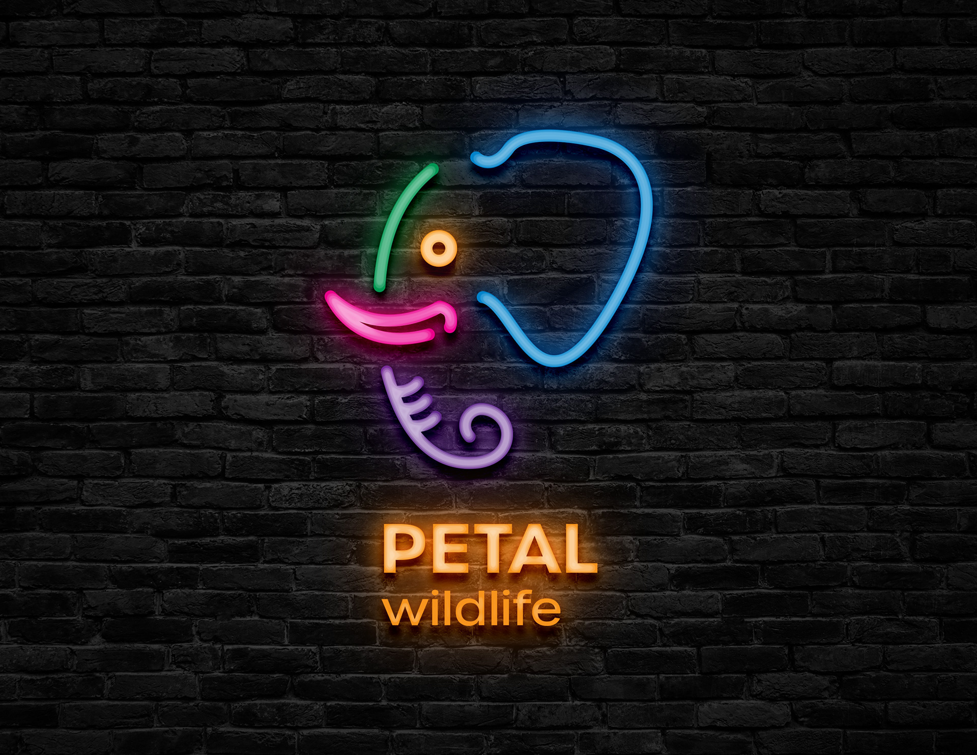
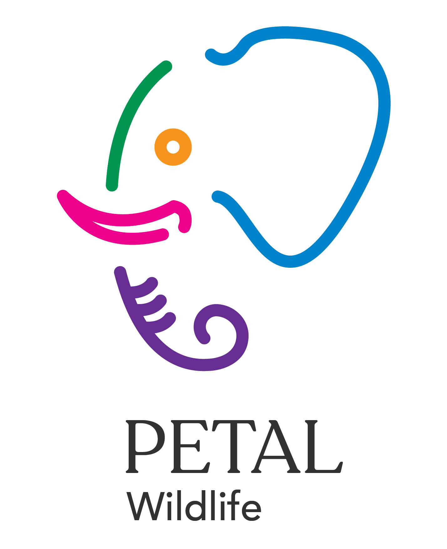
Revised Mark:
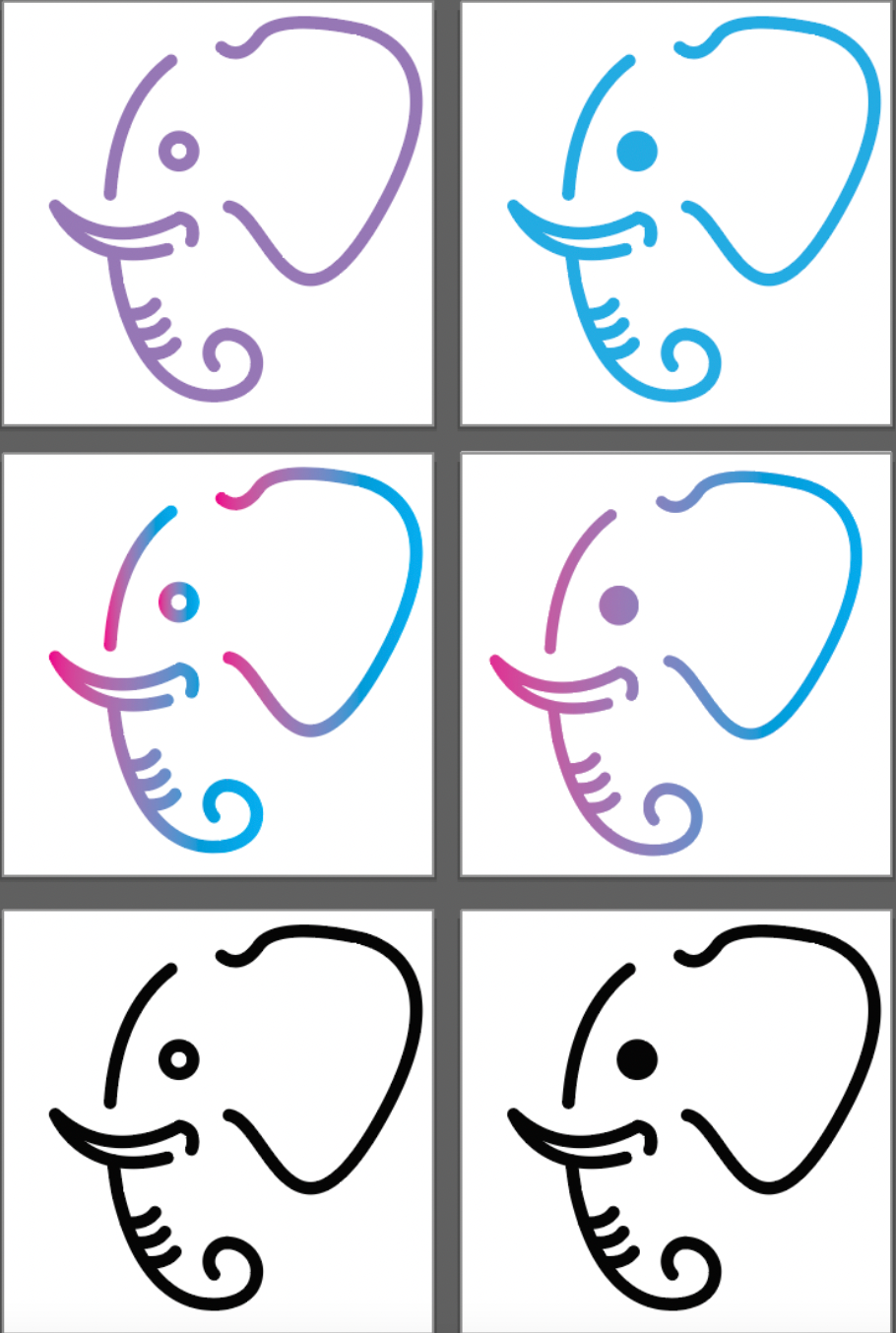
I took some of those critiques to revise my mark. I researched elephant ears and moved forward with the shape of an African Elephant ear. Defining the area where the ear meets the head was extremely beneficial, and I also liked the trunk revision. I tried filling in the eye, but it contrasted with the open feel of the organic shape too much so I nixed that. This set of revisions lead to my final design which is pictured on the far right below.
SURVEY:
Due to the comments about my design not looking like an elephant in the first critique, I wanted to make sure my newest design met that mark. I sent out a survey to my peers, family, and friends in order to gauge whether this design was more successful than my previous ones. My other goal for this survey was to gain feedback based on the overall feelings that my design gives off. PETAL Wildlife's target audience is children, so I wanted to know if my design gave feelings of friendliness and playfulness, for example.
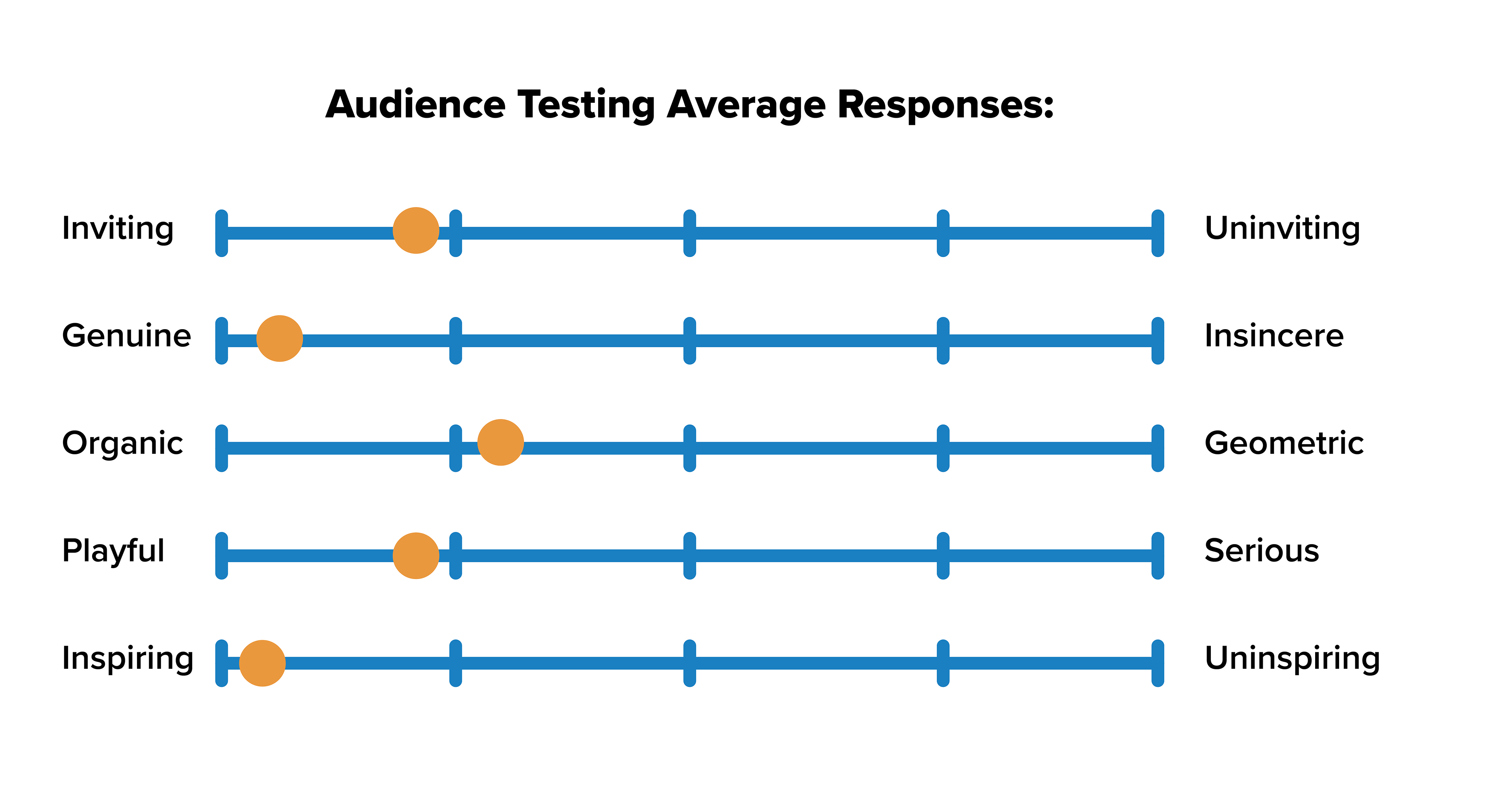
The survey results were extremely positive and secured this elephant as my final design.
I collected the data from my survey and arranged them visually in the image to the left. It was important to me that the design gave off inviting, genuine, and playful energies because I felt that was important in capturing the essence of children into a mark. I felt those feelings would best target children as the main audience.
Color:
I iterated color and type simultaneously because each color paired with a specific type face created an entirely new mark, so I created many versions before I landed on my final typeface and color palette. Some of my many iterations can be seen below.
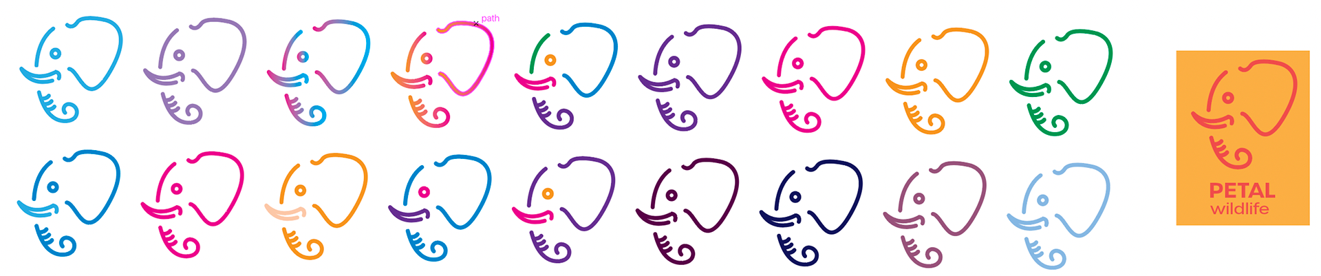
I chose this color palette because when I think back to what colors I was drawn to as a kid, I think of vibrant, bold colors. This color palette reminded me of my own childhood, which gave my design a welcoming feeling that I believe only this set of colors was able to provide. During another class critique, my classmates felt the same, which solidified this choice.
Type:
Choosing the typeface was difficult. I initially explored mainly serifs because I thought it looked nice against the organic, delicate form of the elephant. Some of those tests are below.

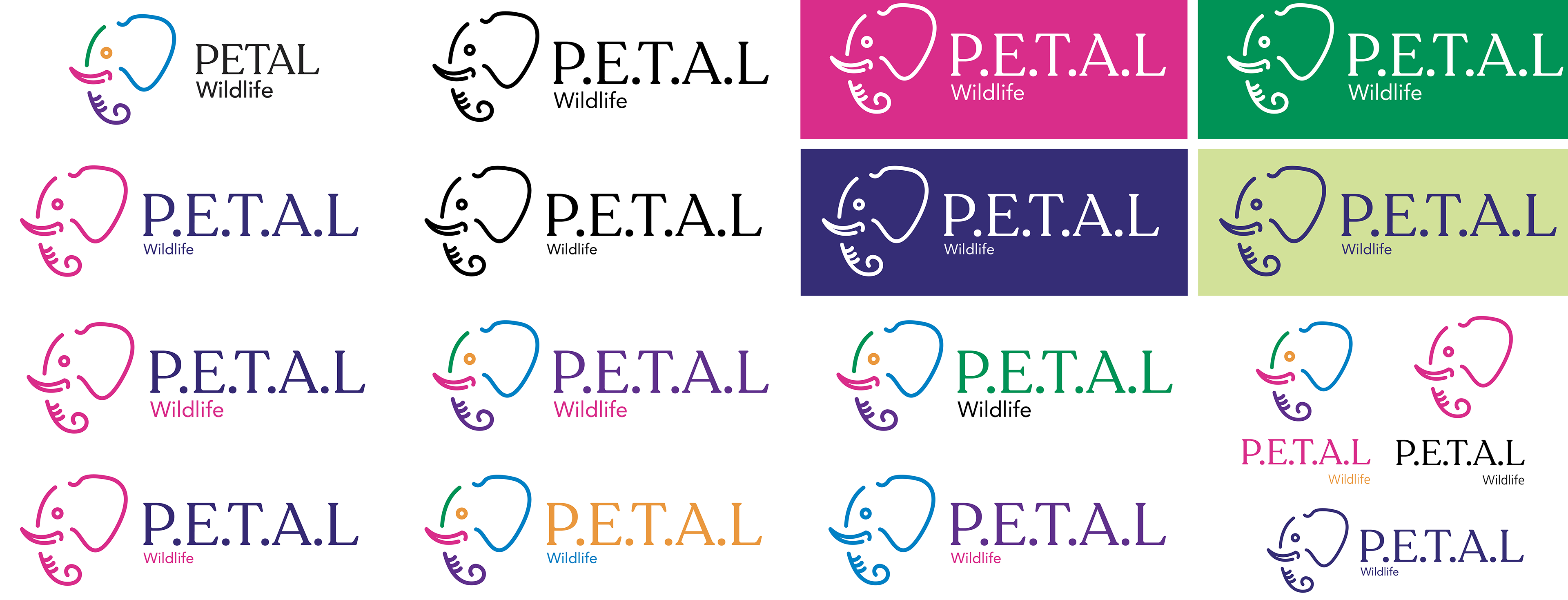

I decided on this typeface on the left, but was not fully happy with it. Because I initially thought a serif would be better for my form, and I received a comment about using a serif in the first critique, I decided on this font too quickly before giving sans serifs a chance. I went back to the drawing board and quickly came across the typeface Urbane.
This typeface instantly created the sense of "wildlife rescue" that I was picturing in my head. It gave a sense of boldness while also feeling approachable and inviting. It perfectly contrasted my open formed mark without competing with it. When I found Urbane I immediately began color testing which is pictured above.
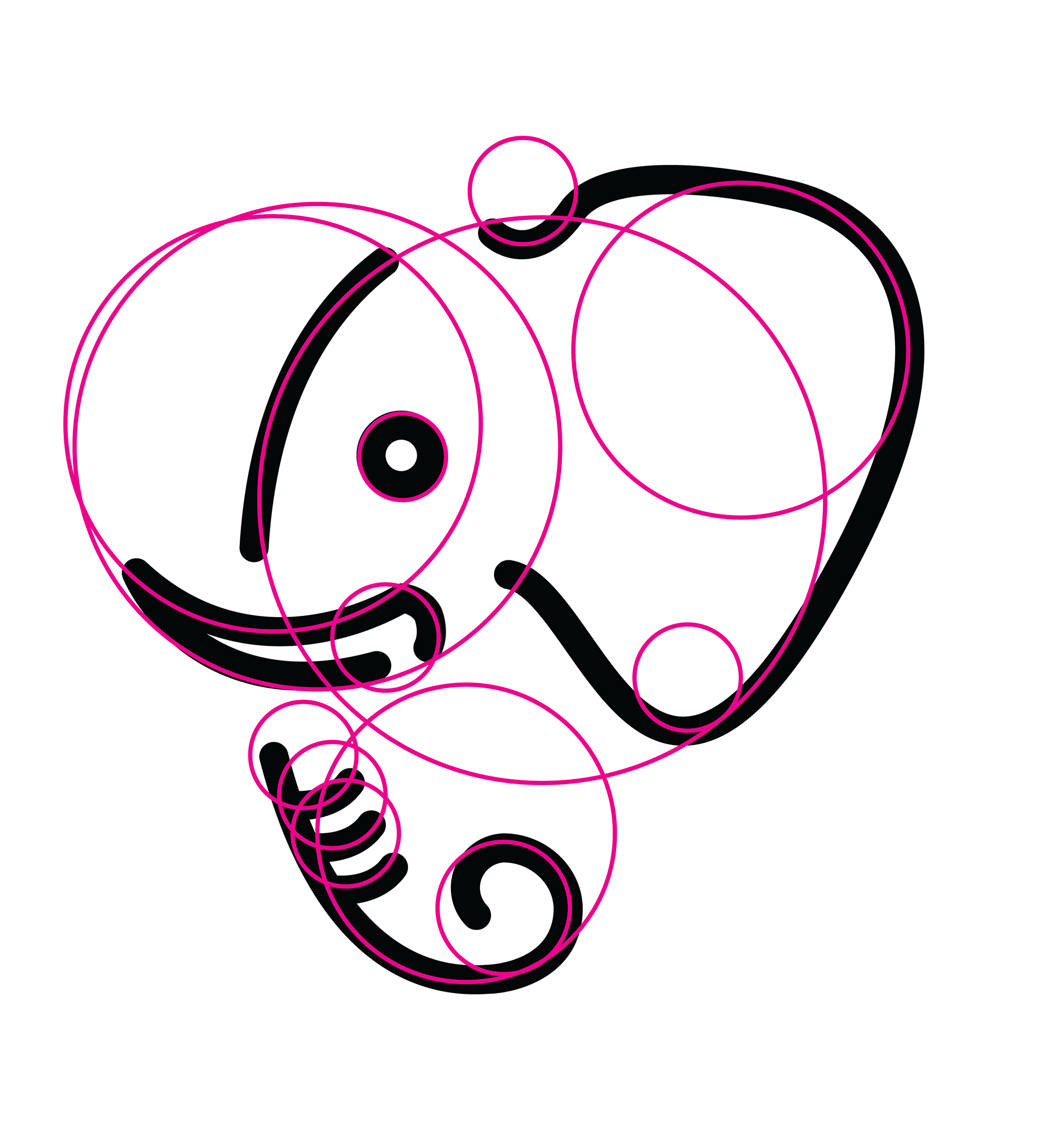
Finalizing the Design:
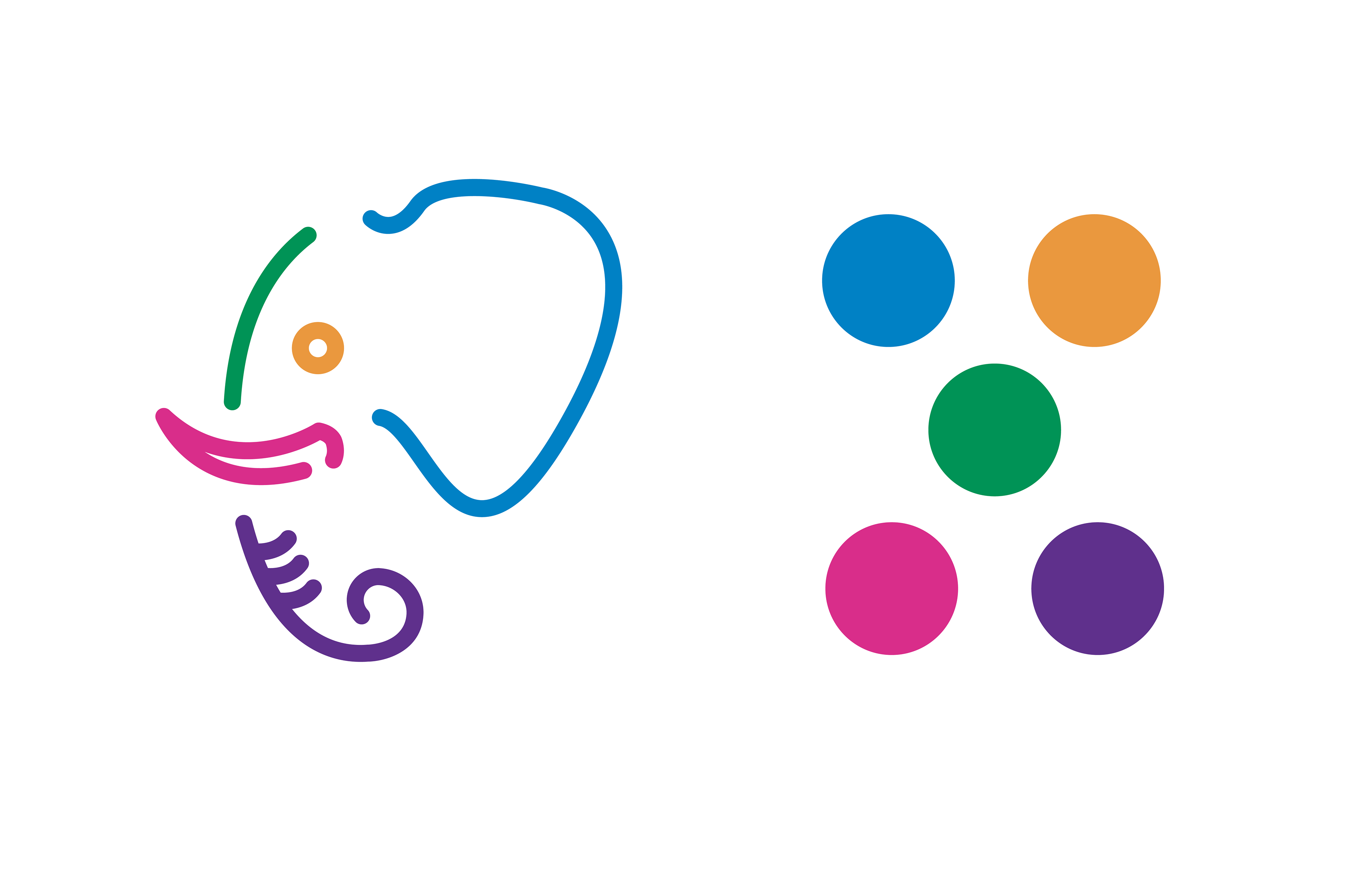
Now that I had decided my color palette and typeface, I created a grid so I could perfect my spacing and scale, allowing for the mark to be perfectly proportioned. I also created circles on top of my mark to capture where the curves are and ensure they are even.

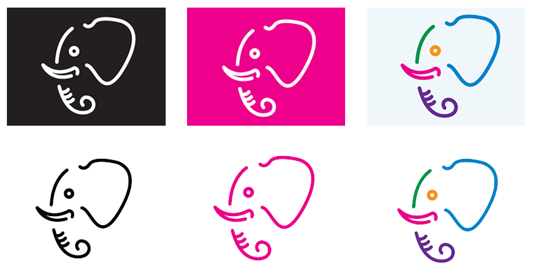
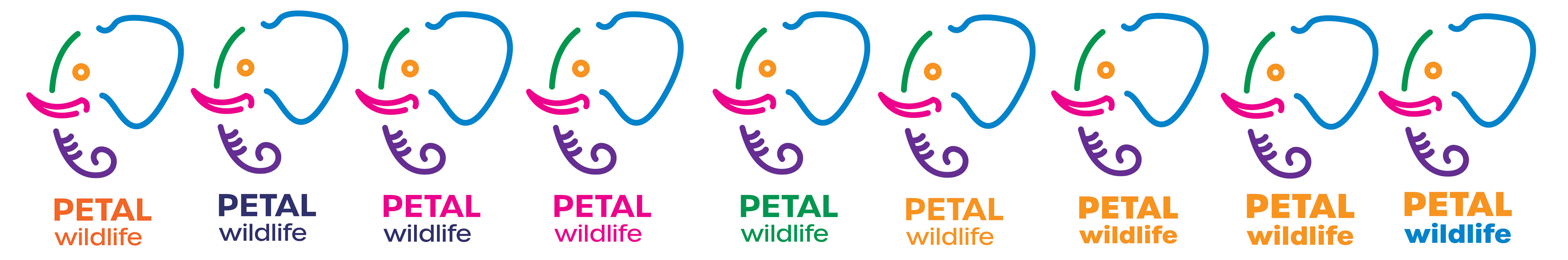
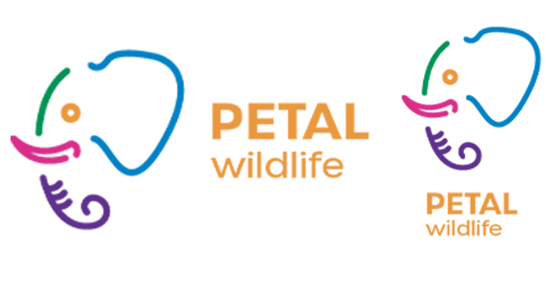
Final Mark:
Pictured below is my final mark in both vertical and horizontal arrangements.
Pictograms:
I created six supplementary pictograms that would be useful throughout PETAL Wildlife's new branding. From left to right, the icons are "global outreach", "research" or "experimenting", "learning", "about us", "our mission", and "shopping cart".