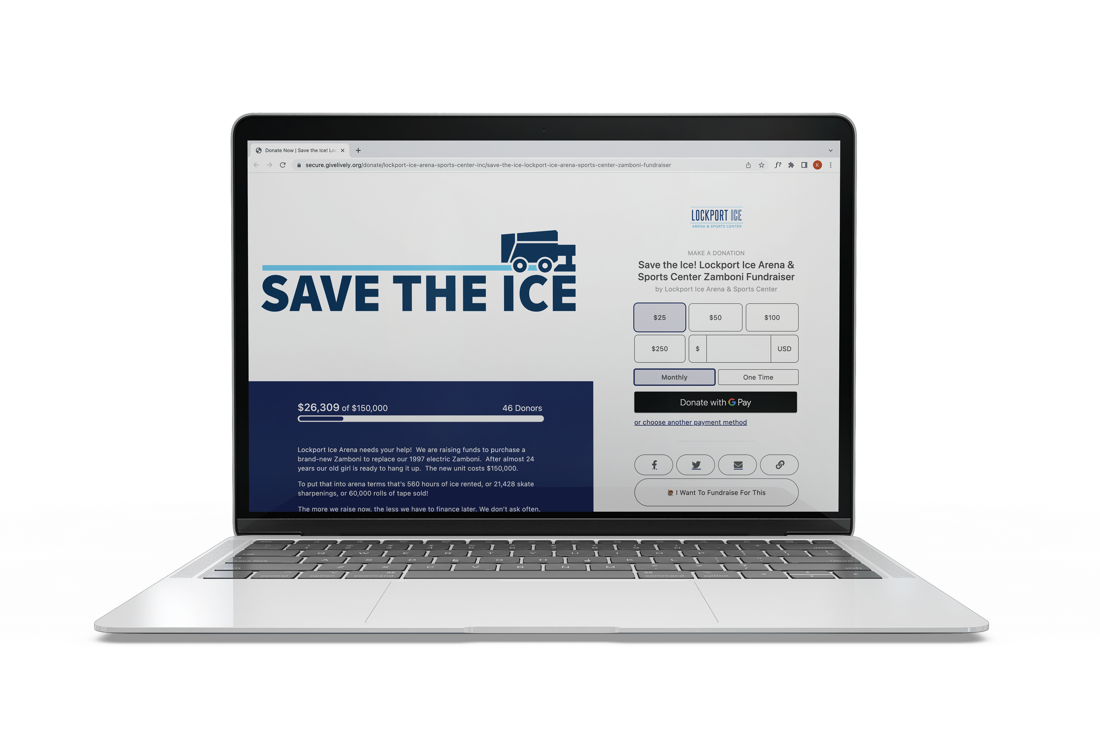
Above is an image of my design in use. Lockport Arena used this mark as the visual identity for their campaign.

Final Logotype
The client's only requirements was that the mark was a logotype and included a zamboni visual. I kept the design clean, legible, and straight forward, allowing for a seamless addition to the arena branding they already have, which shares this color palette.
The main application of this design is visibility on their donation site, which is linked below.